ClassPass Partner Website
Web Design & UX Research
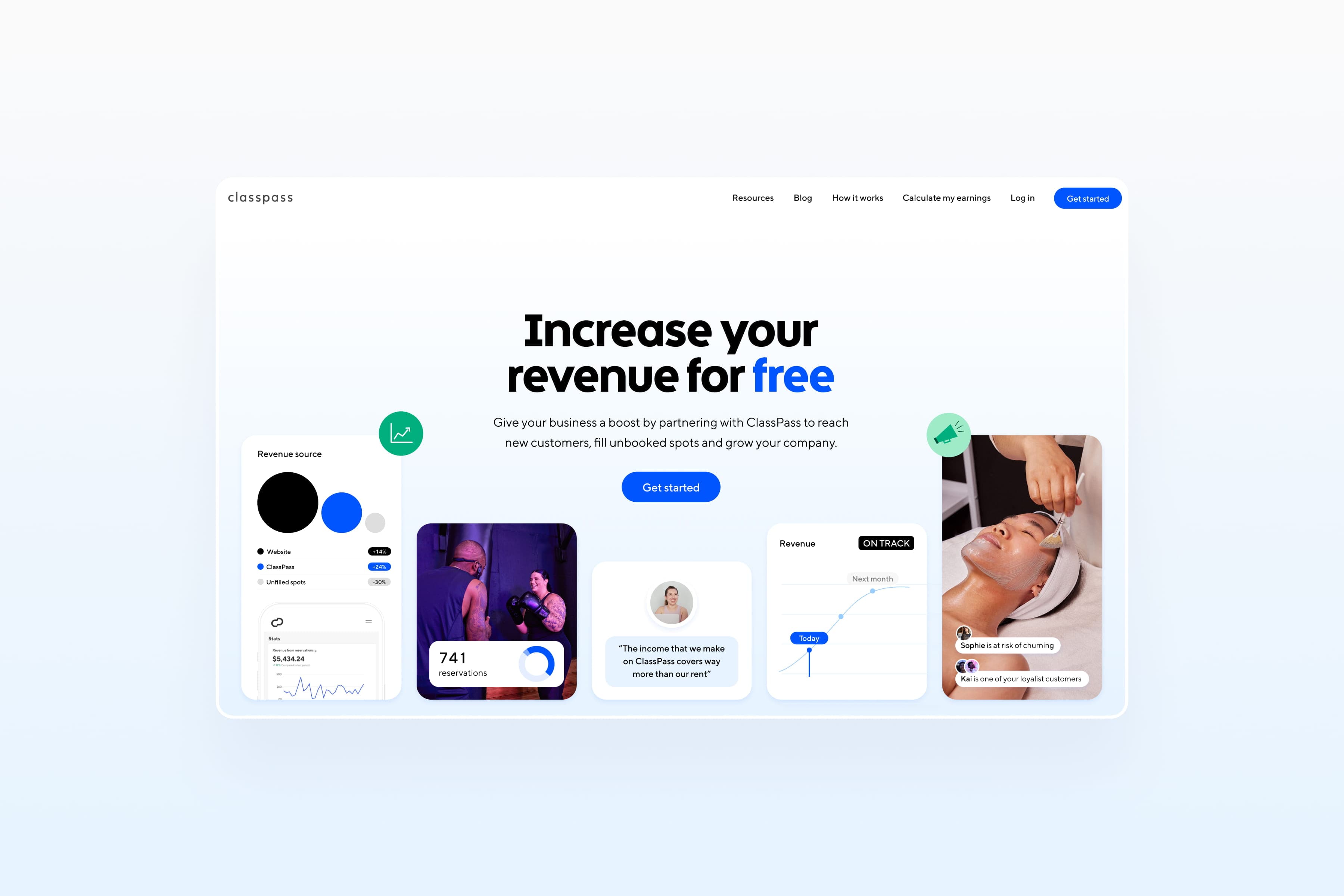
ClassPass aimed to revamp its Partner website to improve user experience and increase engagement. The existing site was cluttered and outdated, causing confusion among potential partners.
The challenge
User feedback highlighted significant navigation issues, unclear call-to-actions (CTAs), and lengthy, intimidating submission forms. The primary goal was to simplify the user journey and effectively communicate the partnership value, ultimately boosting form submissions. The redesign process took six months and involved several key steps.
Approach
User interviews provided insights from existing partners and potential users, while competitor analysis identified best practices. A review of website analytics revealed high-traffic areas and common drop-off points. Based on research, key goals included simplifying navigation, improving visual hierarchy, enhancing CTAs, and streamlining forms. Low-fidelity wireframes outlined the new structure, and high-fidelity prototypes were developed in Figma, showcasing a clean, modern layout with intuitive navigation. User testing sessions validated the design, indicating that users found it more appealing and easier to navigate. Adjustments were made, especially to the form design, to enhance usability. The design was handed off to the development team, focusing on responsive design, optimized loading times, and analytics integration to track user behavior post-launch.
Results
- •8% increase in form submissions within the first month
- •Enhanced user engagement and clearer presentation of partnership benefits
- •Higher satisfaction levels indicated by user feedback
- •Improved navigation contributing to lower bounce rates
Deliverables
- •UX Research & User Interviews
- •Competitor Analysis
- •Low-fidelity Wireframes
- •High-fidelity Figma Prototypes
- •Responsive Web Design
- •Design System Components
Category
Web Design