Kite Pre-Launch Branding
Brand Identity & Icon System
Kite, a wellness software brand, needed a fresh brand identity that would position it as a premium, enterprise-focused platform purpose-built for complex, multi-location fitness and wellness businesses.
The challenge
The goal was to reflect the sophistication of its product suite while pushing an exciting and approachable visual identity that would scale as the company grew. The brand needed to resonate with high-level decision-makers in the wellness and fitness tech space.
Approach
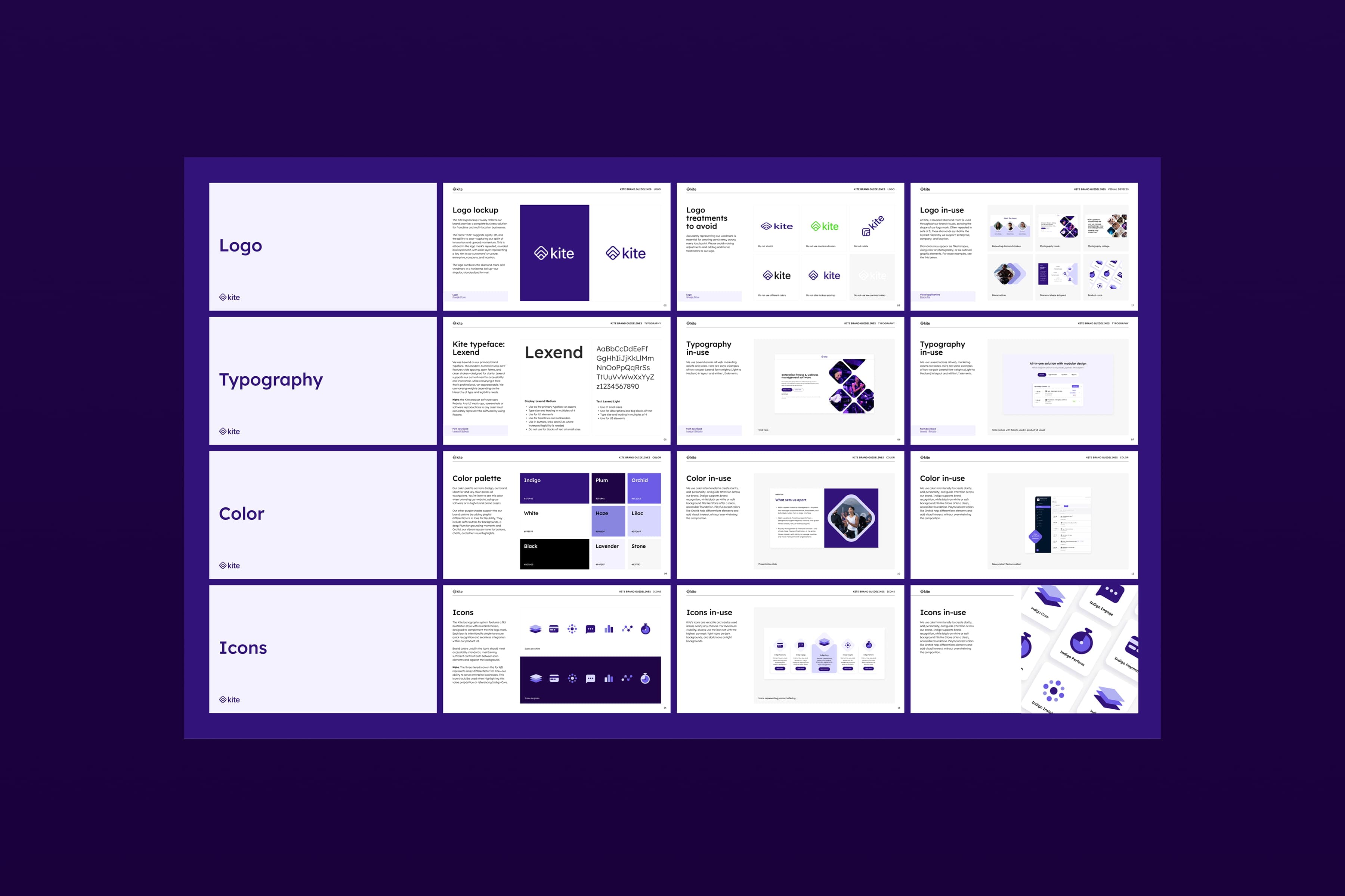
I helped evolve the brand identity to feel more modern, trustworthy, and enterprise-ready. While expanding the brand color palette, I introduced a new visual system centered around a refined logo with rounded corners—an element echoed throughout iconography and UI styling to create a cohesive, polished look. The updated identity is clean, scalable, and designed to resonate with high-level decision-makers. In exploring Kite's brand identity, I explored motifs repeated in sets of 3. Kite's logo contains diamonds symbolizing the layered hierarchy they support. The iconography system's I explored offered visuals that supported Kite's product offering across wellness brands on three key levels: enterprise, company, and location.
Results
- •Complete brand identity system ready for launch
- •Scalable iconography system across three hierarchy levels
- •Cohesive visual language for enterprise positioning
- •Modern, trustworthy brand perception
Deliverables
- •Brand Book
- •Typography System
- •Iconography System (Layered two-tone, Layered, Gradient, Rounded flat)
- •Visual Devices and Styling
- •Website Design for Launch
Category
Branding